# flume를 활용해서 노드 기반 UI를 구현하는 방법
- 본 포스팅에서는 flume라이브러리의 기본적인 사용방법에 대해서 소개하려고 합니다.

# Github Page
https://github.com/chrisjpatty/flume
GitHub - chrisjpatty/flume: Extract logic from your apps with a user-friendly node editor powered by React.
Extract logic from your apps with a user-friendly node editor powered by React. - GitHub - chrisjpatty/flume: Extract logic from your apps with a user-friendly node editor powered by React.
github.com
# 공식사이트
Flume
Extract business logic from your apps with a user-friendly node editor powered by React.
flume.dev
# 사용법
- 라이브러리를 설치합니다
$ yarn add flume- 그리고 아래와 같이 Node들이 포함될 Editor 컴포넌트를 정의합니다.
import React from 'react'
import { NodeEditor } from "flume";

const App = () => {
  return (
    <div style={{width: 800, height: 600}}>
      <NodeEditor />
    </div>
  )
}
- 이제는 추가하고 싶은 노드, 연결 폰트에 대한 정의들을 추가하면 됩니다. Flume 문서 페이지에서 가져온 예시입니다. 다음과 같은 형태를 구현하기 위한 코드입니다
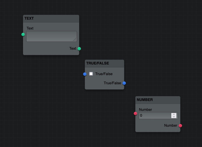
- 노드는 크게 Port와 Control로 나눌 수 있으며, Control의 경우 노드안에서 처리, 변경, 입력되는 값에 대한 것으로, checkbox, text, number 등이 있습니다.
import { FlumeConfig, Colors, Controls } from 'flume'

const config = new FlumeConfig()
config
  .addPortType({
    type: "string",
    name: "string",
    label: "Text",
    color: Colors.green,
    controls: [
      Controls.text({
        name: "string",
        label: "Text"
      })
    ]
  })
  .addPortType({
    type: "boolean",
    name: "boolean",
    label: "True/False",
    color: Colors.blue,
    controls: [
      Controls.checkbox({
        name: "boolean",
        label: "True/False"
      })
    ]
  })
  .addPortType({
    type: "number",
    name: "number",
    label: "Number",
    color: Colors.red,
    controls: [
      Controls.number({
        name: "number",
        label: "Number"
      })
    ]
  })
  .addNodeType({
    type: "string",
    label: "Text",
    description: "Outputs a string of text",
    inputs: ports => [
      ports.string()
    ],
    outputs: ports => [
      ports.string()
    ]
  })
  .addNodeType({
    type: "boolean",
    label: "True/False",
    description: "Outputs a true/false value",
    initialWidth: 140,
    inputs: ports => [
      ports.boolean()
    ],
    outputs: ports => [
      ports.boolean()
    ]
  })
  .addNodeType({
    type: "number",
    label: "Number",
    description: "Outputs a numeric value",
    initialWidth: 160,
    inputs: ports => [
      ports.number()
    ],
    outputs: ports => [
      ports.number()
    ]
  })
- 만약 여러 개의 output 포트를 설정하려면 outputs에 아래와 같이 정의하시면 됩니다. input도 동일한 구조로 여러 개의 포트를 추가하실 수 있습니다.
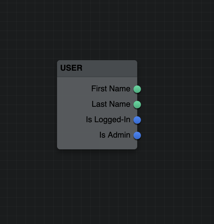
import { FlumeConfig, Colors, Controls } from 'flume'

const config = new FlumeConfig()
config
/*  ...  */
  .addNodeType({
    type: "user",
    label: "User",
    description: "Outputs attributes of the current user",
    initialWidth: 130,
    outputs: ports => [
      ports.string({
        name: "firstName",
        label: "First Name"
      }),
      ports.string({
        name: "lastName",
        label: "Last Name"
      }),
      ports.boolean({
        name: "isLoggedIn",
        label: "Is Logged-In"
      }),
      ports.boolean({
        name: "isAdmin",
        label: "Is Admin"
      })
    ]
  })
- 만약 노드에 들어온 input을 가지고 간단한 처리를 하는 부분은 Controls를 이용하여 처리합니다. select, number, checkbox, input등의 기본적인 Control들을 제공하지만, 만약 이미지를 보여주는 등의 직접 정의한 처리가 필요한 경우에는 Controls.custom을 사용해서 아래와 같이 사용할 수 있습니다. 커스터마이즈한 컴포넌트를 사용하는 경우에 대한 더 자세한 설명은 여기서 확인하시기 바랍니다.
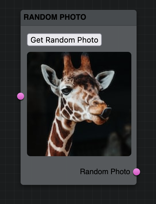
.addPortType({
  type: "randomPhoto",
  name: "randomPhoto",
  label: "Random Photo",
  color: Colors.pink,
  controls: [
    Controls.custom({
      name: "randomPhoto",
      label: "Random Photo",
      defaultValue: "D6TqIa-tWRY", // Random Unsplash photo id
      render: (data, onChange) => (
        <RandomPhotoComponent
          url={data}
          onChange={onChange}
        />
      )
    })
  ]
})
'개발 > React' 카테고리의 다른 글
| [React][TailwindCSS][유용한 툴] HyperUI - 무료 Tailwind 컴포넌트 (0) | 2023.06.28 |
|---|---|
| [React][유용한 툴] 간단하게 빵빠레, 폭죽 효과 추가하기 (0) | 2023.06.07 |
| [React][유용한 툴] react-tooltip으로 툴팁추가하기 (0) | 2023.04.07 |
| [React][라이브러리] re-resizable를 사용해서 Resizing이 가능한 컴포넌트 구현 방법 (0) | 2023.04.04 |
| [React][라이브러리] react-rnd를 활용해서 Drag & Drop 구현하기 (0) | 2023.03.25 |